Beautiful, Production-Ready UI Avatars 👩🏼💼
Get instant access to a diverse, high-quality collection of user interface avatars optimized for Figma, React, and modern web design systems.
























































































































































































































Introduction
What are UI Avatars
UI avatars are visual representations of users, teams, organizations, or brands within a digital interface. They help people quickly recognize identities without reading names, making interfaces faster to scan and easier to navigate. An avatar can be a profile photo, initials, company logo, icon, emoji, illustration, or any custom graphic that represents an account.
Modern avatar components are widely used across web applications, mobile apps, SaaS dashboards, social platforms, CRMs, project management tools, and collaboration software. Beyond displaying profile pictures, avatars improve visual hierarchy, strengthen brand identity, and create a more personal user experience. A flexible avatar system typically supports multiple sizes, shapes, status indicators, badges, fallback initials, and avatar groups to ensure consistency throughout an application.
Use cases
Common avatar UI layouts and patterns
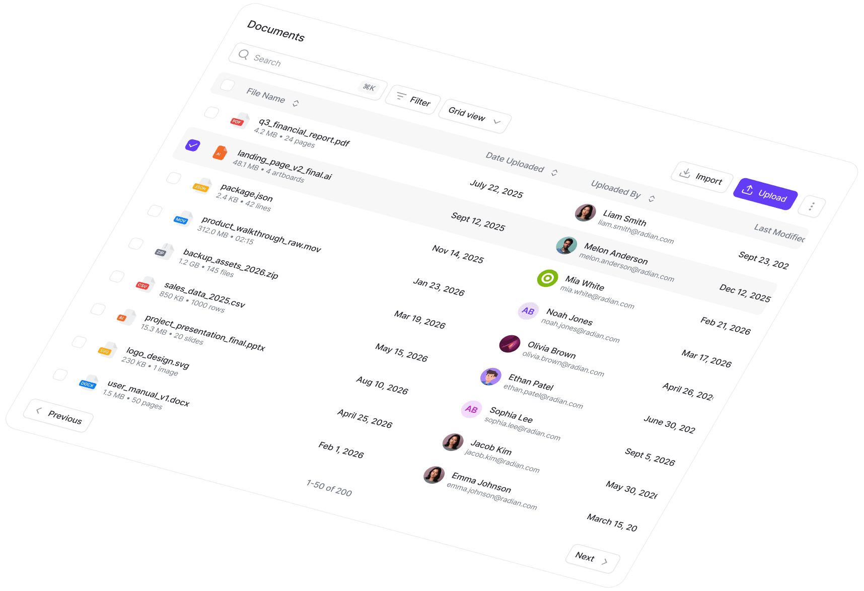
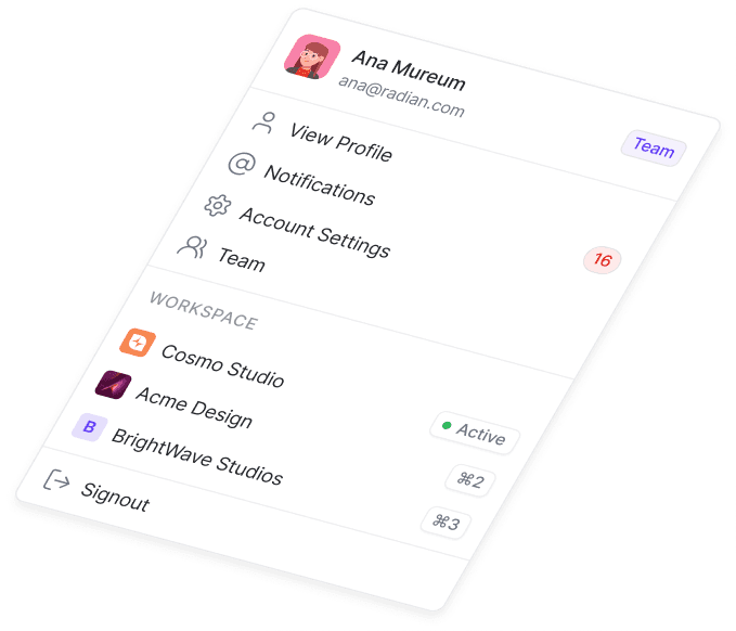
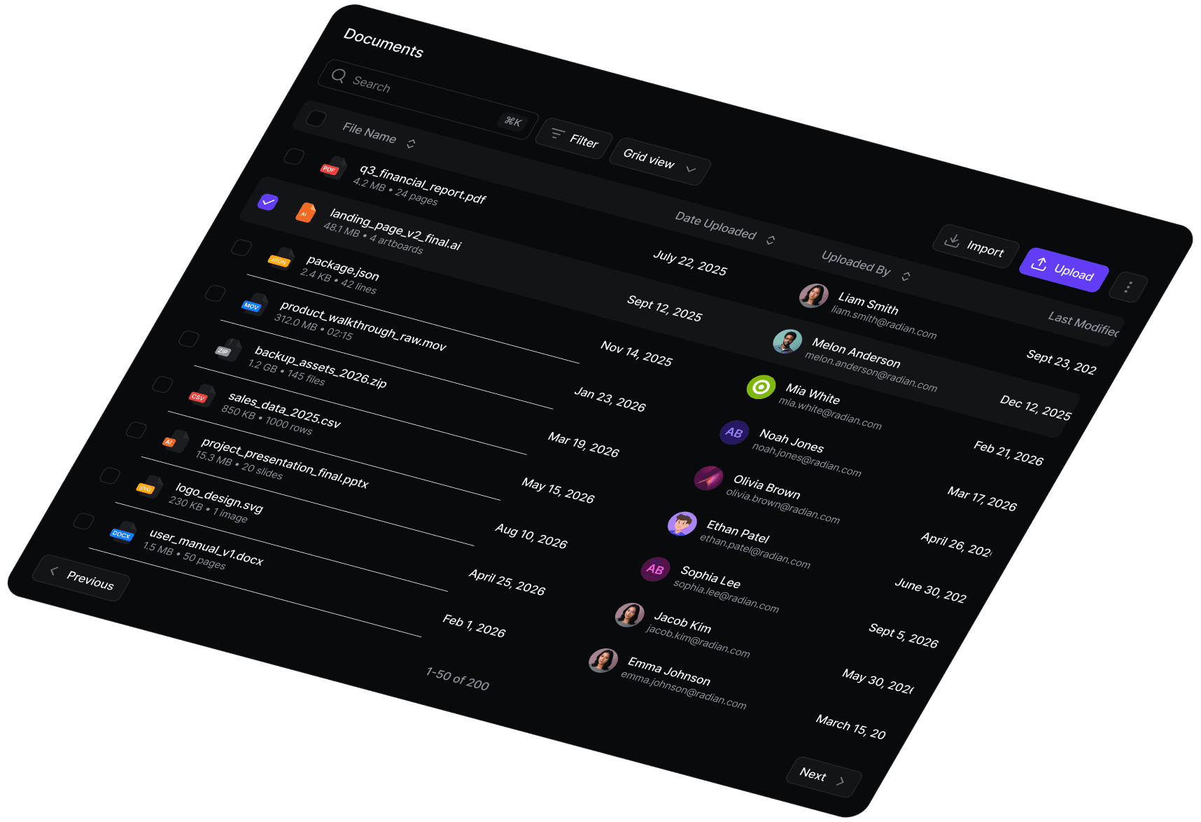
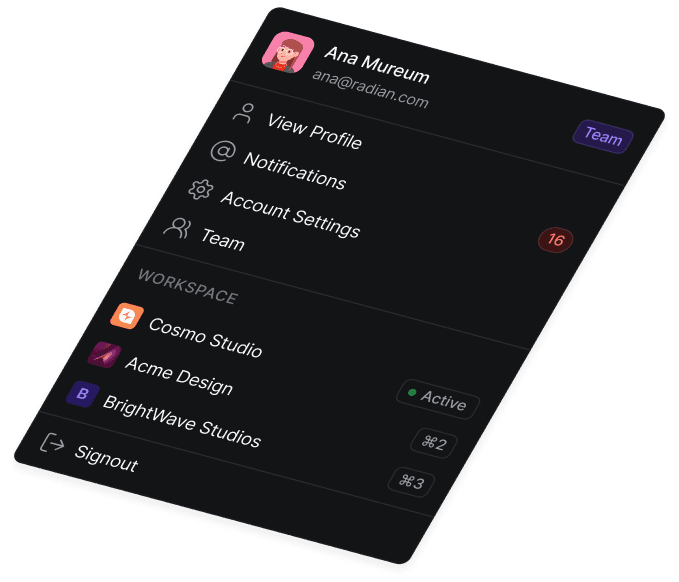
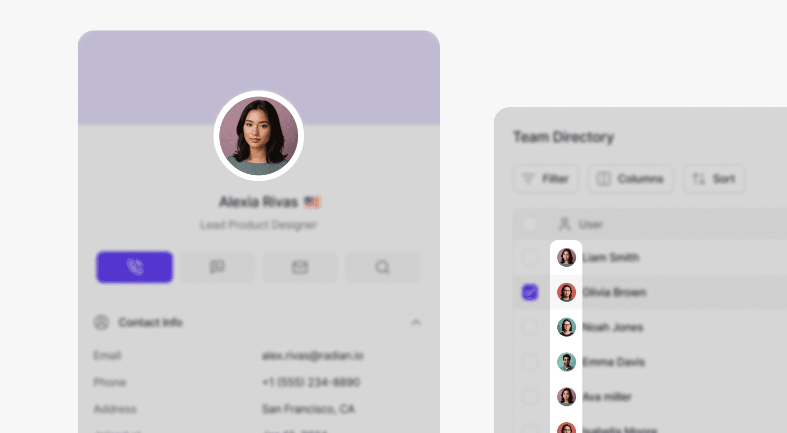
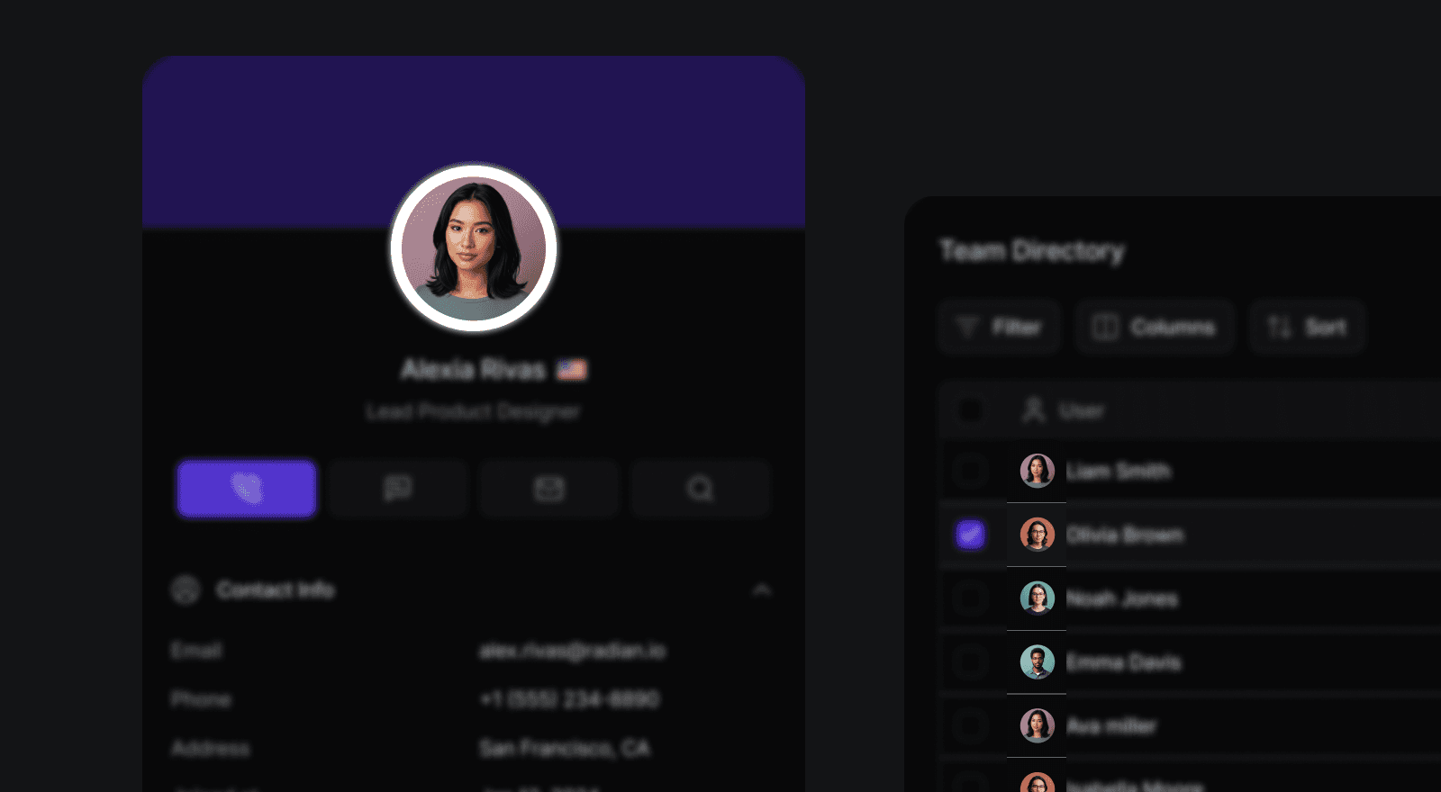
User avatars appear throughout modern interfaces because they provide instant visual recognition while reducing cognitive load. Instead of relying solely on text, avatars help users identify people, teams, and organizations at a glance. A well-designed avatar component adapts to many interface patterns, from navigation menus and messaging apps to data tables and collaborative workspaces.
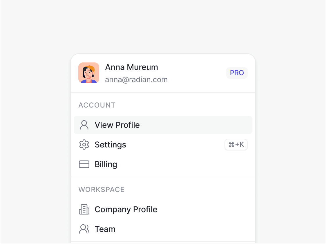
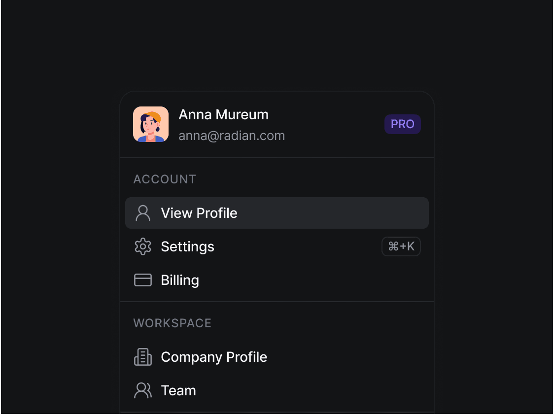
- Navigation & Account Access – Display the currently signed-in user while providing quick access to profiles, account settings, and authentication options.
- Messaging & Collaboration – Distinguish participants in chats, comments, video meetings, and shared workspaces for easier communication.
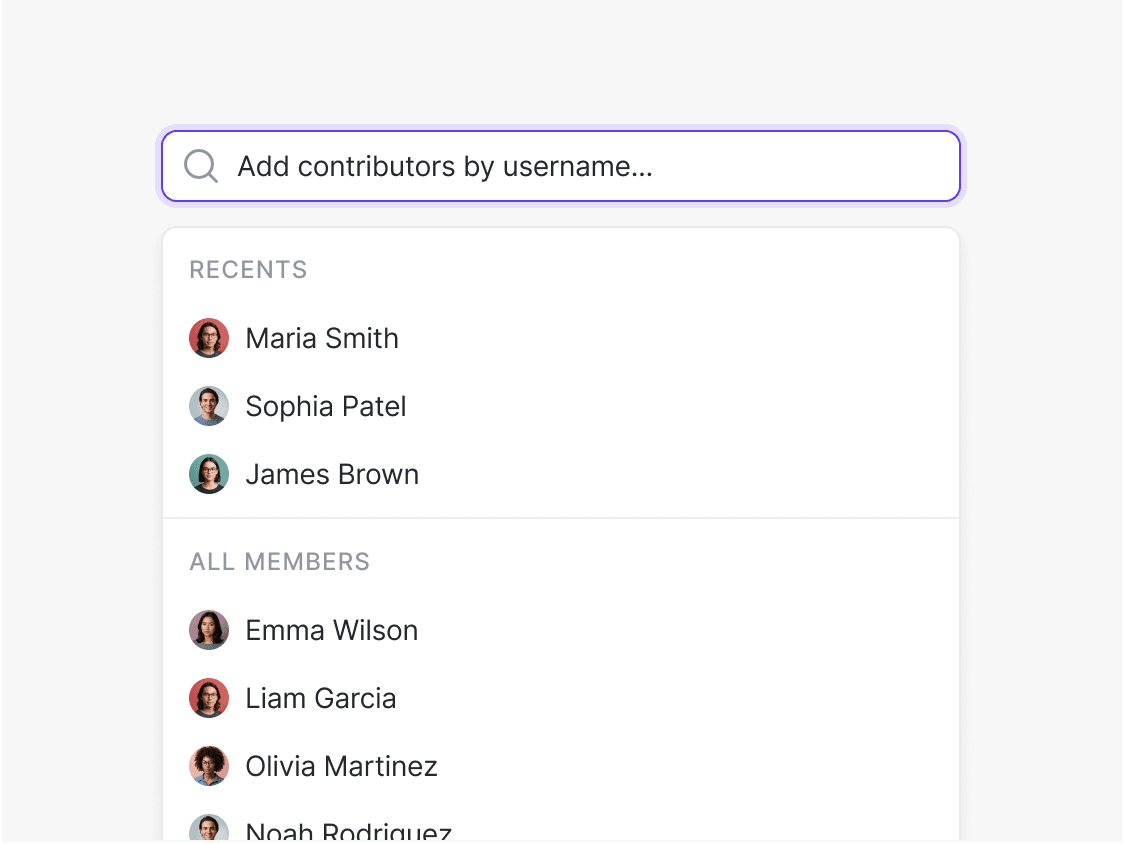
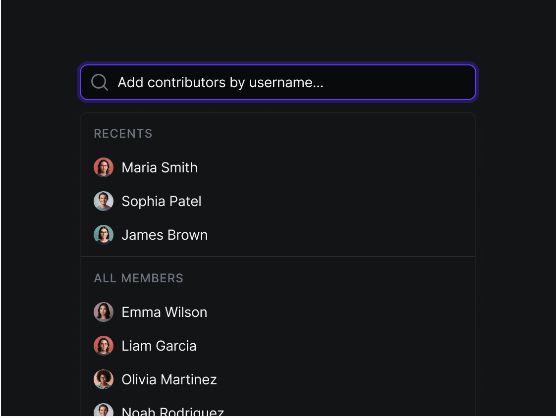
- Lists & Data Displays – Pair avatars with names in customer directories, employee lists, CRM records, and user management tables to improve readability and recognition.
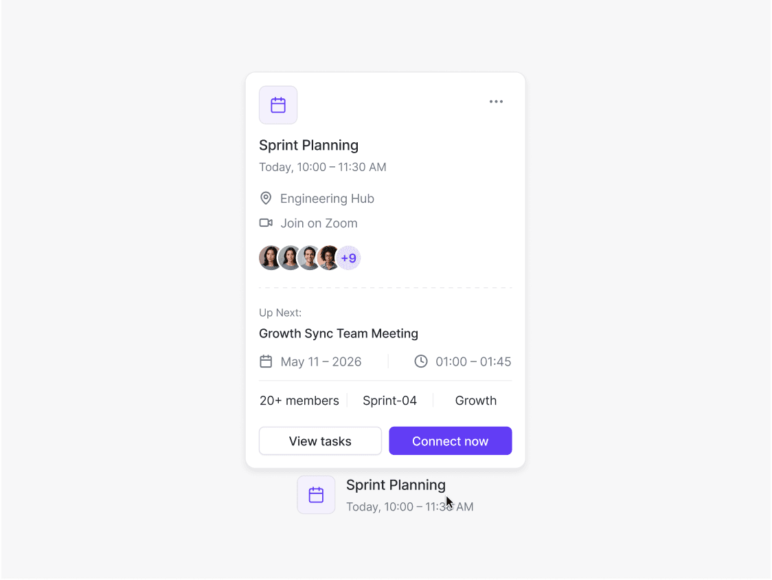
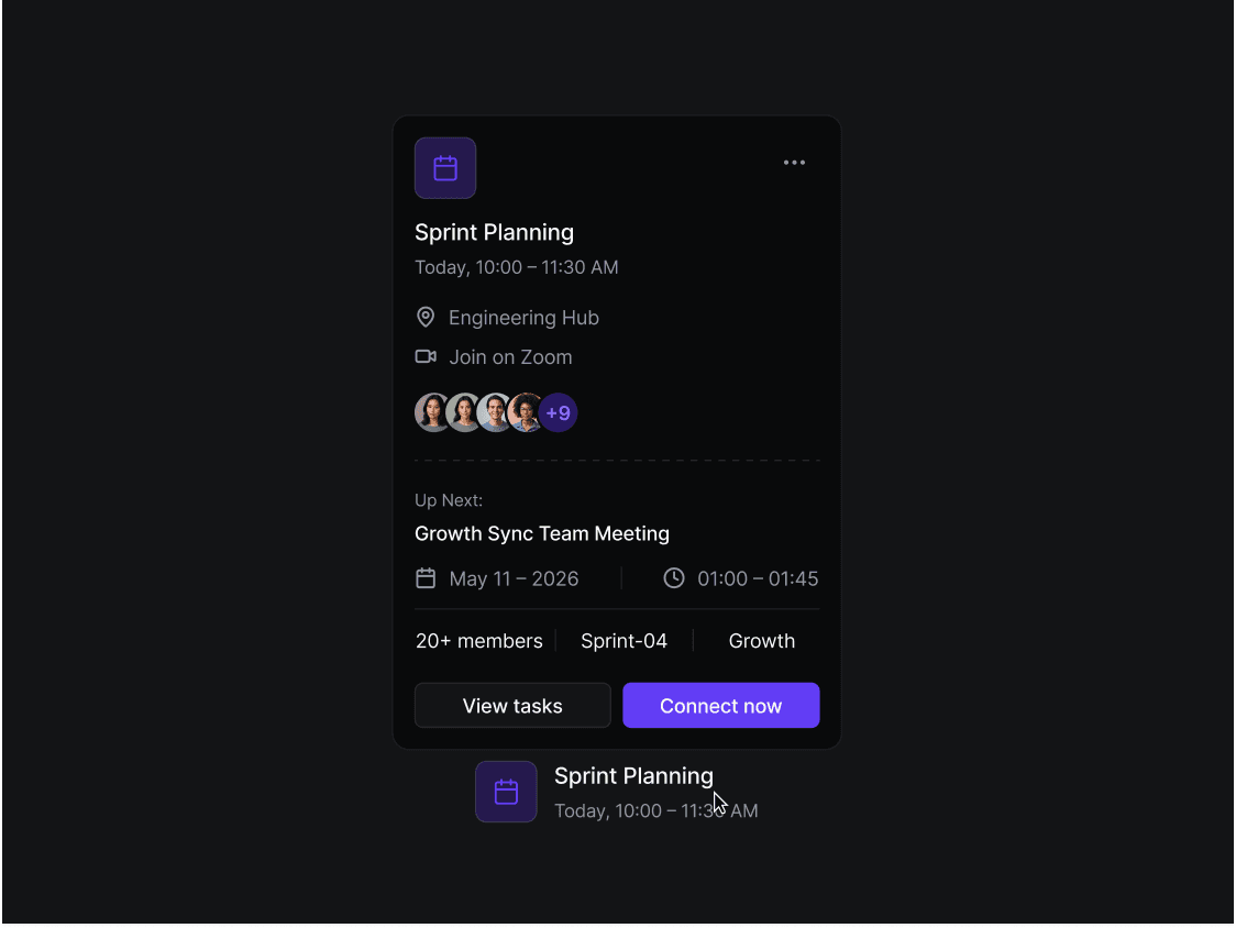
- Avatar Groups and Teams – Represent multiple collaborators in a compact layout with overlap and overflow indicators
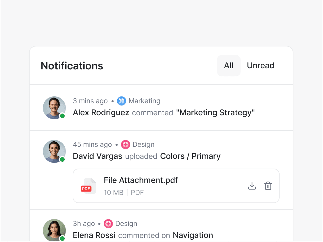
- Comments & Activity Feeds – Highlight authors across discussions, notifications, changelogs, and social interactions.
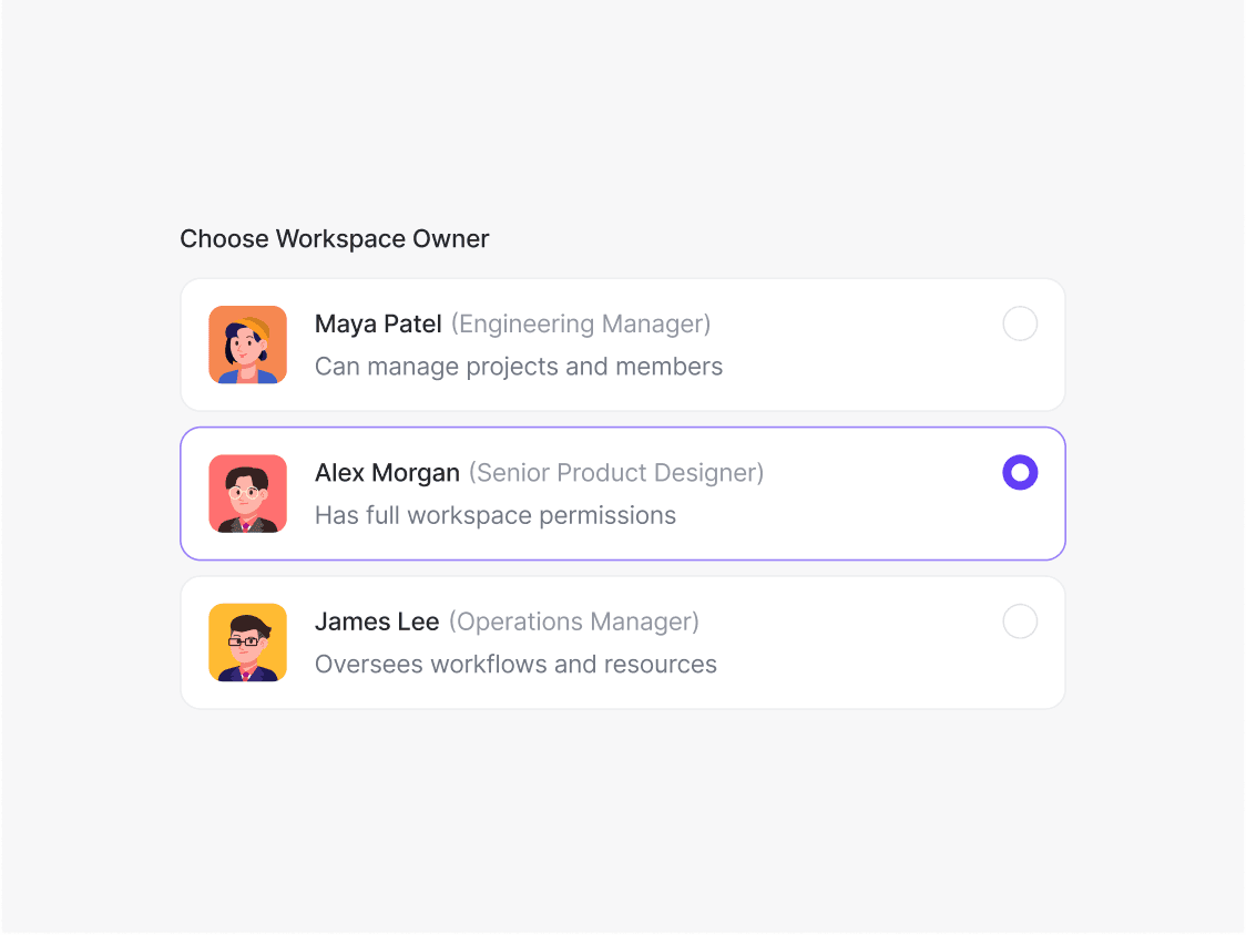
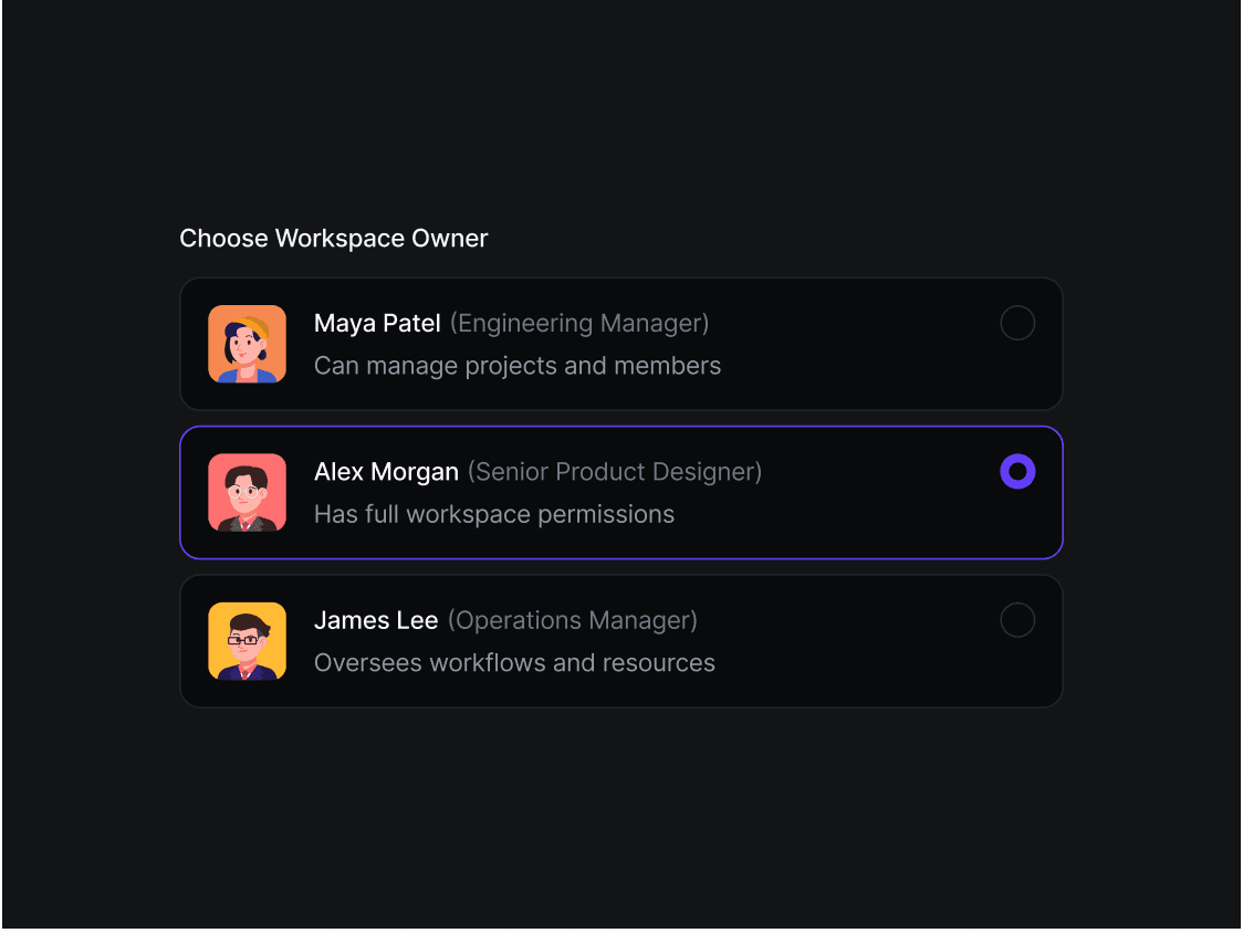
- Project Ownership – Show assignees, reviewers, contributors, and document owners throughout productivity and project management applications.
- Presence & Status Indicators – Display online, offline, away, busy, or verified states using badges that communicate user availability in real time.
- Organizations & Brands – Use logos or branded avatars to represent companies, workspaces, departments, and business accounts.
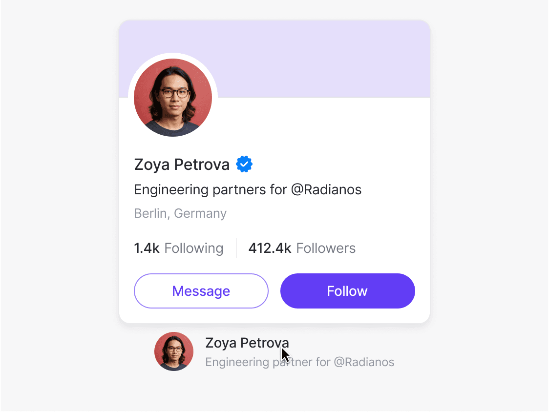
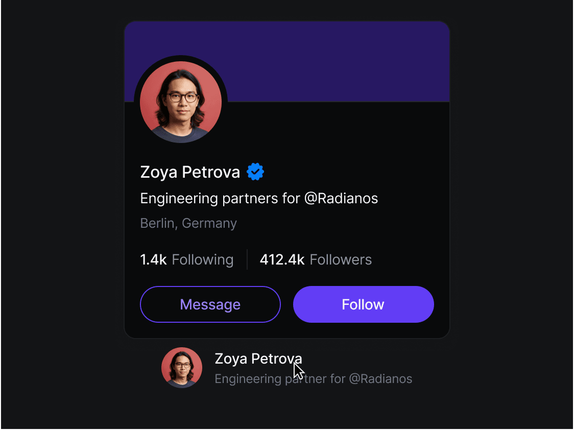
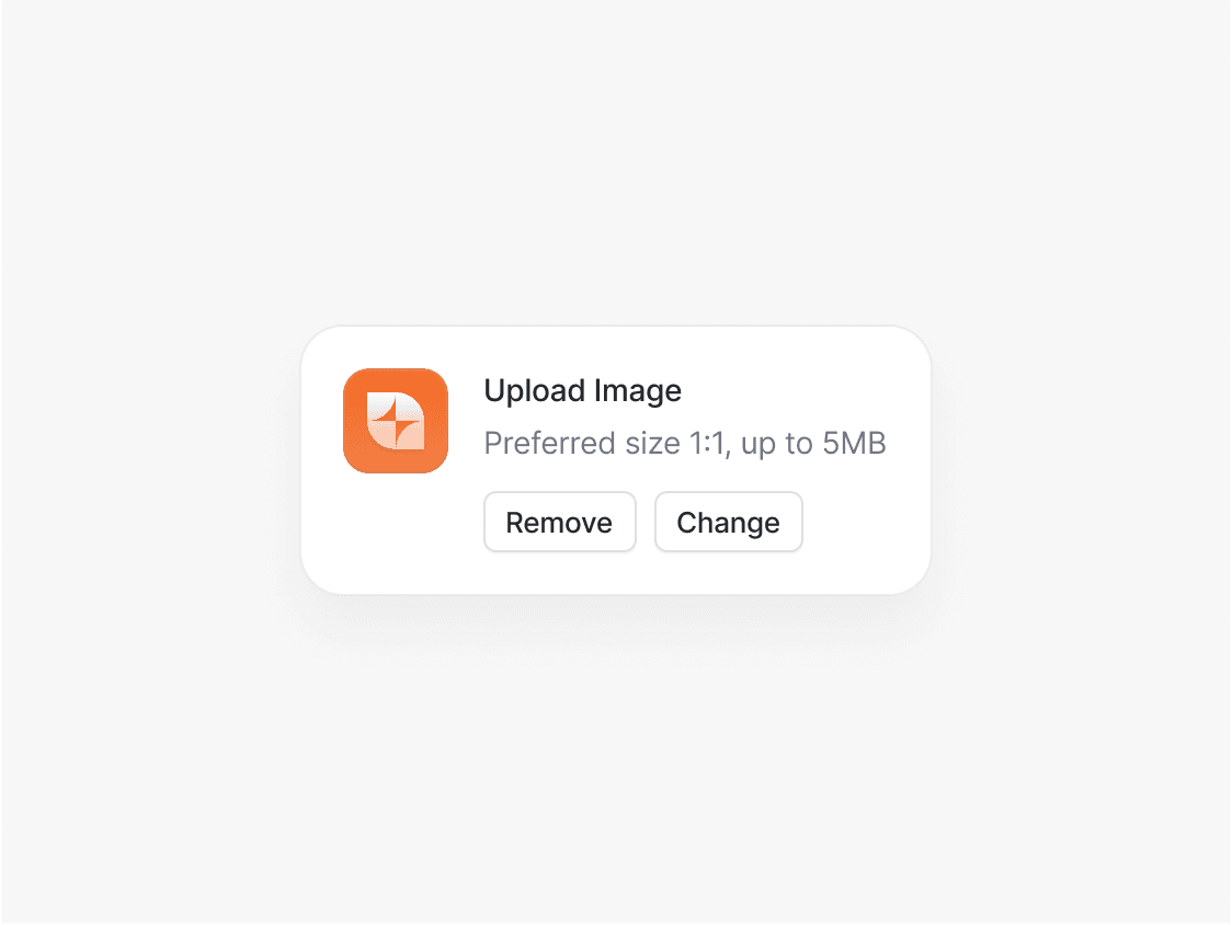
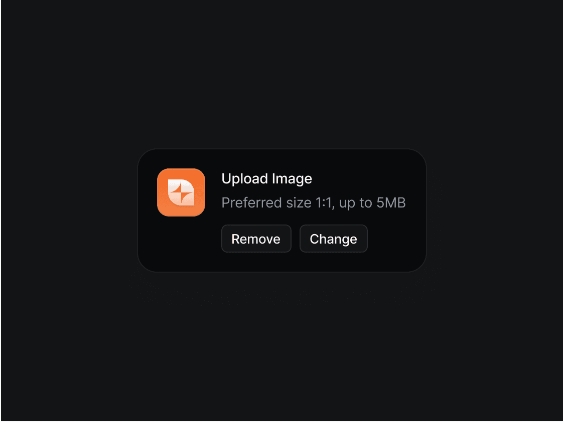
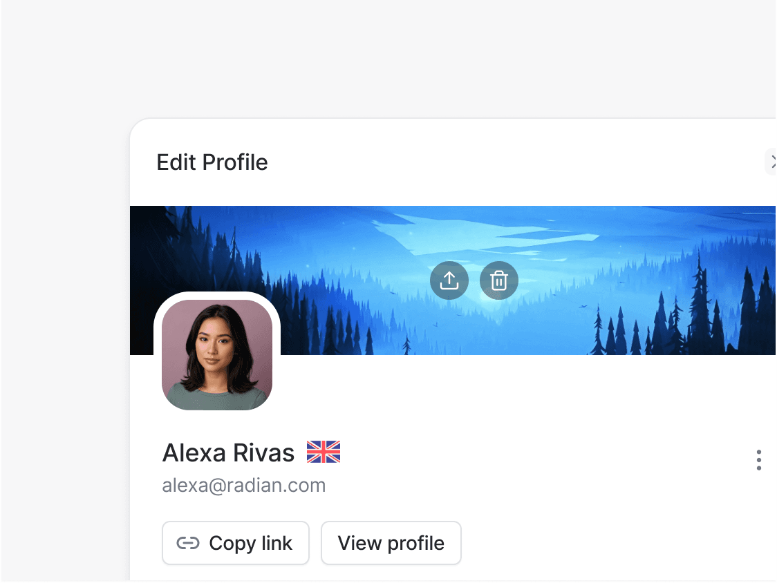
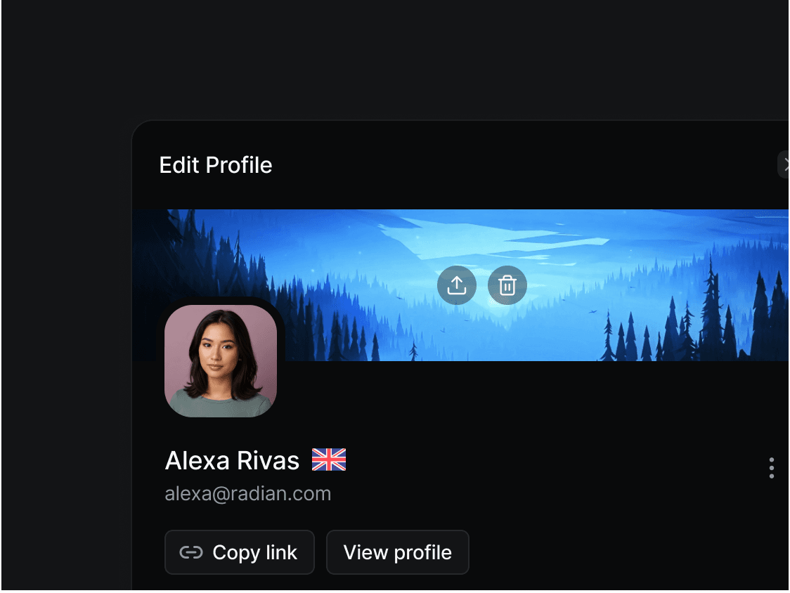
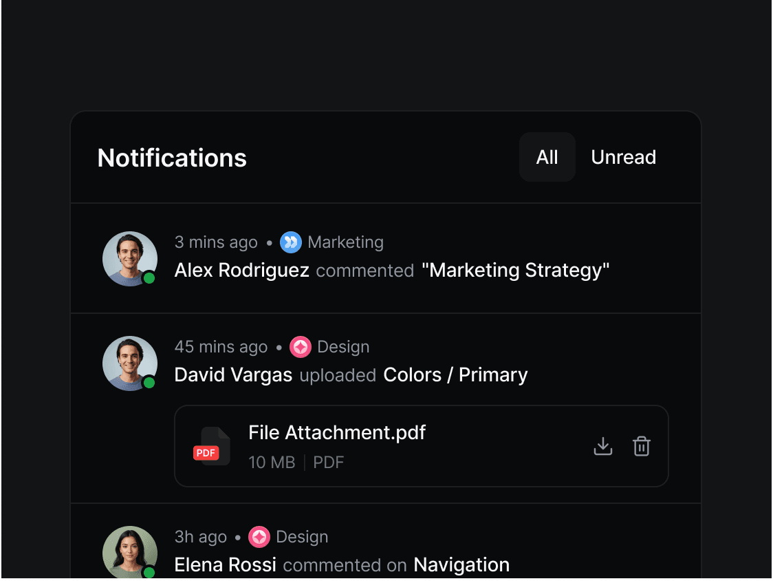
Below is a collection of avatars used in various cases and their visualization in user interface.
Design
Avatar UI Design Best Practices
A well-designed avatar component should remain recognizable, accessible, and consistent across every part of your application. Whether you're building a SaaS dashboard, social platform, messaging app, or admin panel, following established avatar design patterns improves usability while maintaining a polished interface. When designing avatar components, consider these best practices:
- Support multiple sizes - Provide consistent sizing options for various use cases such as navigation bars, tables, cards, profiles, and detailed views.
- Always include a fallback - Display user initials, a generic icon, or a placeholder illustration whenever a profile image fails to load or hasn't been uploaded.
- Keep shapes consistent - Use circular avatars for people and rounded square or square avatars for organizations or products to establish visual consistency.
- Use status indicators carefully - Online, offline, busy, away, and verified badges should be subtle without distracting from the primary avatar.
- Optimize image quality - Use appropriately sized images, lazy loading, and responsive assets to improve loading performance without sacrificing clarity.
- Design for accessibility - Provide descriptive alt text, sufficient color contrast, keyboard support where applicable, and avoid relying solely on color to communicate status.
- Handle large groups gracefully - Use overlapping avatar groups with overflow indicators such as +5 or +12 instead of displaying every participant.
- Respect privacy - Provide placeholder avatars for anonymous users and avoid exposing profile images when privacy settings restrict visibility.
- Stay consistent across the product - Reuse the same spacing, border radius, badge placement, and sizing scale throughout your design system.
Development
Avatar Component Architecture and Development
A production-ready avatar component should be built for flexibility, performance, and maintainability. Rather than focusing solely on appearance, developers should design avatar components that handle image loading, fallback states, customization, accessibility, and composition in a predictable way. A well-architected component becomes a reusable building block that can be used consistently across navigation, messaging, tables, user profiles, and collaborative interfaces. Here are some good development practices for Avatars.
- Build a composable component API - Separate the avatar container, image, fallback, and status indicator into independent subcomponents that can be composed together.
- Support controlled and uncontrolled fallbacks - Automatically switch between profile images, initials, placeholder icons, or custom fallback content without additional application logic.
- Expose styling through props and class names - Allow developers to customize size, shape, borders, colors, and variants while still supporting utility classes and design tokens.
- Optimize image rendering - Lazy-load avatar images, serve responsive image sizes, cache remote assets, and prevent layout shifts during loading.
- Handle loading and error states gracefully - Detect failed image requests, retry when appropriate, and seamlessly render fallback content instead of broken images.
- Design for composition - Make it easy to attach tooltips, dropdown menus, badges, notifications, presence indicators, or context menus without modifying the core avatar component.
- Support avatar groups natively - Provide APIs for overlapping layouts, configurable spacing, stacking order, overflow counters, and maximum visible avatars.
- Keep the component framework-agnostic where possible - Separate business logic from styling so the avatar can integrate with React, Vue, Angular, or other component systems.
- Integrate with design tokens - Use semantic tokens for spacing, colors, border radius, shadows, and sizing to ensure consistency across themes.
- Provide TypeScript support - Export strongly typed component props, variants, and events to improve the developer experience and reduce runtime errors.
FAQ
Frequently Asked Questions
Have a question or need clarification? Our team is here to help and we're ready to provide all the answers you need.
Production-Ready UI Blocks for Designers and Developers
Radian OS bridges the gap between design and development. Access production-ready UI blocks, developer documentation, and a fully synced Figma UI kit to launch your next project in record time.