Colors
Minimal and effective color for your entire Ul
Colors in Radian design system is built on minimal yet effective colors that is flexible enough to build an entire product on. The color system provides variables for all of the most common use cases while building an interface.
Colors are organized based on usage like text, border, background, & primary colors to ensure using color is easier for most people.
Preview Colors
Nancy Mureum
#2126
+977 9861038740
| Su | Mo | Tu | We | Th | Fr | Sa |
|---|---|---|---|---|---|---|
Saru Shrestha
saru@radian.com
PROGENERAL
View Profile
Keyboard shortcuts
Change logs
Slack Community
Support
API
Settings
Log out
Report an issue
What area are you having problems with?
Invite team members
Send instructions to join your workspace
Cookie Settings
Manage your cookie settings here.
Strictly Necessary
These cookies are necessary for website functionality.
Functional Cookies
These cookies enable personalized features on the site.
Color Variables
Background
| Token | Hex Value | Usage |
|---|---|---|
| bg-bg | #FFFFFF | Base Background |
| bg-fill1 | #F9F9FA | Use to give soft gray color for backgrounds |
| bg-fill2 | #F4F4F6 | Use [ bg-fill2 ] if gray background section needs more visibility |
| bg-fill3 | #E9E9EC | Slightly darker than [ bg-fill2 ] |
| bg-fill4 | #DEDEE3 | Slightly darker than [ bg-fill3 ] |
Text
| Token | Hex Value | Usage |
|---|---|---|
| text-fg | #1C1D21 | Use for Headers and Title Text |
| text-fg-secondary | #545463 | Use for Descriptions or paragraph |
| text-fg-tertiary | #868698 | Similar to text secondary, but slighly dimmer |
| text-fg-disabled | #C8C8D0 | Used when ui elements are disabled |
| text-fg-inverse | #FFFFFF | Used on darker colored background |
Border
| Token | Hex Value | Usage |
|---|---|---|
| border-border | #DEDEE3 | Solid, accessible border used to define & separate UI elements |
| border-soft | #E9E9EC | Use for decorative line and border elements |
| border-alpha | #0A0A0B1F | Transparent border that adjusts based on background color |
| border-soft-alpha | #0A0A0B14 | Decorative transparent border |
Primary
| Token | Hex Value | Usage |
|---|---|---|
| key | #623DF5 | Brand Color |
| accent | #ECE8FC | Pastel version of brand color used for backgrounds |
| focus | #E5DFFB | Used to highlight pastel background elements |
| border | #9981f8 | Border color for primary elements |
| hover | #7655F6 | Used when hovers interactions are present |
| text | #492EB8 | Text color for all primary texts |
Utility
| Token | Hex Value | Usage |
|---|---|---|
| white-inverse | #FFFFFF | White color, will turn to black for dark mode |
| black-inverse | #090A0B | Black color, will turn white in dark moide |
BG elevation
| Token | Hex Value | Usage |
|---|---|---|
| bg-elevation-negative | #F4F4F6 | Used to show negative elevation (Pushed down) |
| bg-elevation-level1 | #FFFFFF | Used to show elevation of component in dark mode |
| bg-elevation-level2 | #FFFFFF | Used to show higher elevation for dark mode |
BG Alpha
| Token | Hex Value | Usage |
|---|---|---|
| bg-fill1-alpha | #0A0A0B05 | Transparent version of fill-1 color, used for elevated components |
| bg-fill2-alpha | #0A0A0B0A | Transparent version of fill-2 color |
| bg-fill3-alpha | #0A0A0B14 | Transparent version of fill-3 color |
| bg-fill4-alpha | #0A0A0B1F | Transparent version of fill-4 color |
Success
| Token | Hex Value | Usage |
|---|---|---|
| key | #1DA54A | Used to highlight success or positive feedback |
| accent | #E3FCEC | Pastel color for background |
| focus | #D1FADF | Used to highlight pastel background elements |
| border | #2eb85c | Border color for success elements |
| hover | #2EB85C | Used when hovers interactions are present |
| text | #218341 | Text color for all success texts |
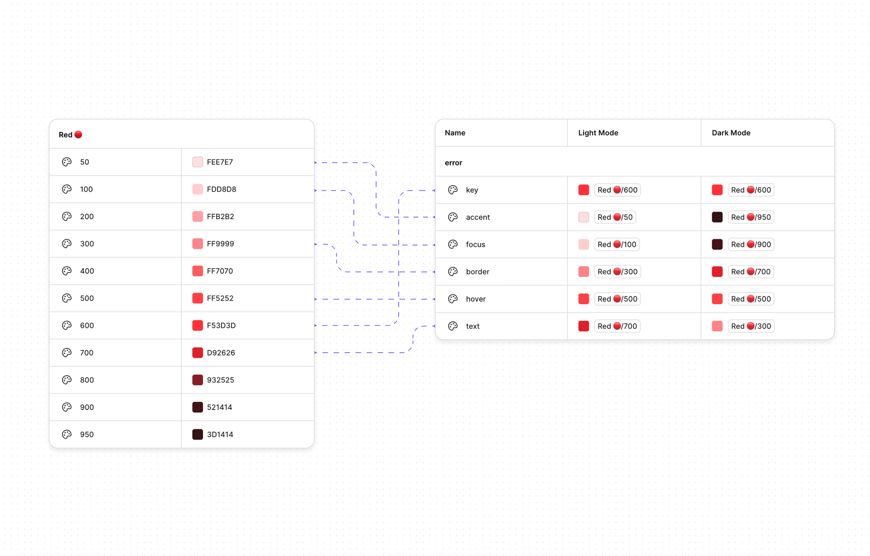
Error
| Token | Hex Value | Usage |
|---|---|---|
| key | #F53D3D | Used to highlight negative or critical feedback |
| accent | #FEE7E7 | Pastel color for background |
| focus | #FDD8D8 | Used to highlight pastel background elements |
| border | #ff7070 | Border color for error elements |
| hover | #FF5252 | Used when hovers interactions are present |
| text | #D92626 | Text color for all error texts |
Warning
| Token | Hex Value | Usage |
|---|---|---|
| key | #FFAA00 | Used to highlight notice or alert feedback |
| accent | #FFF1D6 | Pastel color for background |
| focus | #FFEBC2 | Used to highlight pastel background elements |
| border | #df980c | Border color for warning elements |
| hover | #FFBB33 | Used when hovers interactions are present |
| text | #936710 | Text color for all warning texts |
Info
| Token | Hex Value | Usage |
|---|---|---|
| key | #067FF9 | Used to highlight informational or general feedback |
| accent | #E3F0FC | Pastel color for background |
| focus | #D1E5FA | Used to highlight pastel background elements |
| border | #9eccfa | Border color for info elements |
| hover | #255C93 | Used when hovers interactions are present |
| text | #255C93 | Text color for all info texts |
Customizing your colors
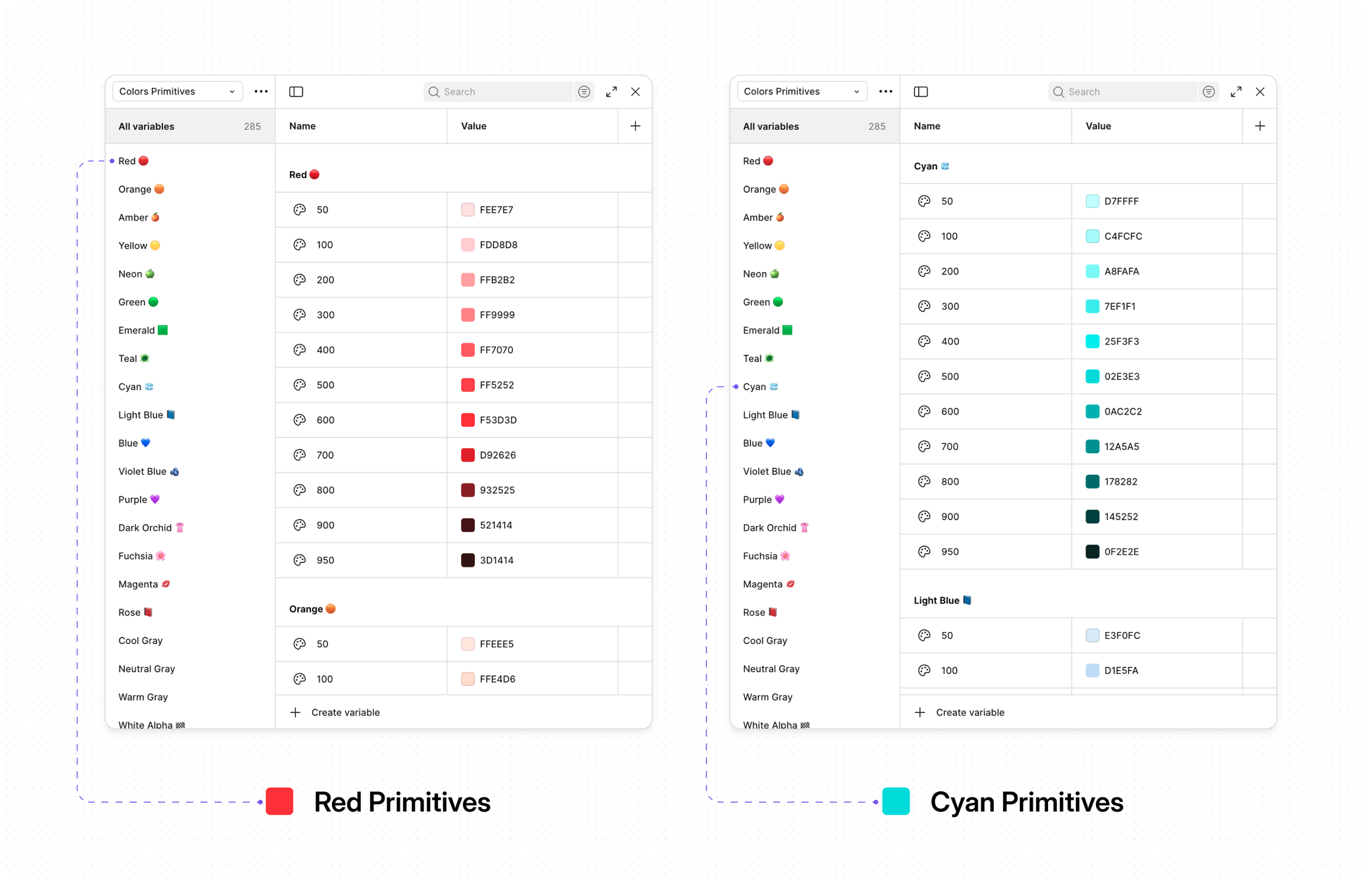
- Explore Color Primitives: Radian already offers 15+ base color ranges to choose from.
- Map Your Tokens(Design): Create a smaller, more manageable set of design tokens that map to specific use cases.
- Map Your Colors(Development): Map the colors from your Figma file to Global CSS file. Convert to OKLCH color format for best performance on all devices.
@import "tailwindcss";
@import "tw-animate-css";

@custom-variant dark (&:is(.dark \*));

@theme {
	--color-primary: oklch(0.528 0.2539 282.58);
	--color-primary-accent: oklch(0.94 0.0271 295.05);
	--color-primary-focus: oklch(0.9169 0.0383 295.46);
	--color-primary-border: oklch(0.6784 0.1708 290.38);
	--color-primary-hover: oklch(0.5768 0.2279 286.25);
	--color-primary-text: oklch(0.528 0.2539 282.58);

	--color-success: oklch(0.6334 0.171 148.65);
	--color-success-accent: oklch(0.9685 0.0336 157.66);
	--color-success-focus: oklch(0.9489 0.0556 156.34);
	--color-success-border: oklch(0.7761 0.2117 148.55);
	--color-success-hover: oklch(0.6901 0.1748 149.64);
	--color-success-text: oklch(0.5388 0.1339 149.74);

	--color-error: oklch(0.64 0.22 26.04);
	--color-error-accent: oklch(0.9465 0.0252 17.61);
	--color-error-focus: oklch(0.9133 0.0414 17.93);
	--color-error-border: oklch(0.719 0.1751 22.5);
	--color-error-hover: oklch(0.6786 0.2095 24.66);
	--color-error-text: oklch(0.5716 0.2125 27.27);

	--color-warning: oklch(0.8016 0.1705 73.27);
	--color-warning-accent: oklch(0.9622 0.0384 83.83);
	--color-warning-focus: oklch(0.946 0.0574 85.03);
	--color-warning-border: oklch(0.7318 0.1522 75.09);
	--color-warning-hover: oklch(0.8342 0.1594 79.51);
	--color-warning-text: oklch(0.5461 0.1088 77.73);

	--color-info: oklch(0.6092 0.2041 255.8);
	--color-info-accent: oklch(0.949 0.0213 245.85);
	--color-info-focus: oklch(0.9135 0.0358 249.52);
	--color-info-border: oklch(0.829 0.0811 248.83);
	--color-info-hover: oklch(0.6722 0.1615 251.56);
	--color-info-text: oklch(0.6092 0.2041 255.8);

	--color-bg: oklch(1 0 0);
	--color-fill1: oklch(0.9843 0.0011 197.14);
	--color-fill2: oklch(0.9677 0.0027 286.35);
	--color-fill3: oklch(0.9368 0.0029 264.54);
	--color-fill4: oklch(0.904 0.0055 274.96);

	--color-fg: oklch(0.2738 0.0093 276.77);
	--color-fg-secondary: oklch(0.527 0.0238 276.59);
	--color-fg-tertiary: oklch(0.6683 0.0194 275.5);
	--color-fg-disabled: oklch(0.7366 0.0159 277.76);
	--color-fg-inverse: oklch(1 0 0);

	--color-border: oklch(0.904 0.0055 274.96);
	--color-alpha: color-mix(
		in srgb,
		oklch(0.144 0.0028 247.09),
		transparent 88%
	);
	--color-soft: oklch(0.9368 0.0029 264.54);
	--color-soft-alpha: color-mix(
		in srgb,
		oklch(0.144 0.0028 247.09),
		transparent 92%
	);

	--color-elevation-negative: oklch(0.9677 0.0027 286.35);
	--color-elevation-level1: oklch(1 0 0);
	--color-elevation-level2: oklch(1 0 0);

	--color-white-inverse: oklch(1 0 0);
	--color-black-inverse: oklch(0.144 0.0028 247.09);

	--color-fill1-alpha: color-mix(
		in srgb,
		oklch(0.1452 0.0021 286.13),
		transparent 98%
	);
	--color-fill2-alpha: color-mix(
		in srgb,
		oklch(0.1452 0.0021 286.13),
		transparent 96%
	);
	--color-fill3-alpha: color-mix(
		in srgb,
		oklch(0.1452 0.0021 286.13),
		transparent 92%
	);
	--color-fill4-alpha: color-mix(
		in srgb,
		oklch(0.1452 0.0021 286.13),
		transparent 88%
	);
}

.dark {
	--color-primary: oklch(0.528 0.2539 282.58);
	--color-primary-accent: oklch(0.2622 0.0915 289.13);
	--color-primary-focus: oklch(0.2827 0.1227 284.67);
	--color-primary-border: oklch(0.528 0.2539 282.58);
	--color-primary-hover: oklch(0.5768 0.2279 286.25);
	--color-primary-text: oklch(0.6784 0.1708 290.38);

	--color-success: oklch(0.6334 0.171 148.65);
	--color-success-accent: oklch(0.271 0.0537 151.74);
	--color-success-focus: oklch(0.3887 0.0924 150.55);
	--color-success-border: oklch(0.5388 0.1339 149.74);
	--color-success-hover: oklch(0.6901 0.1748 149.64);
	--color-success-text: oklch(0.7761 0.2117 148.55);

	--color-error: oklch(0.64 0.22 26.04);
	--color-error-accent: oklch(0.2567 0.0648 22.77);
	--color-error-focus: oklch(0.2973 0.0922 24.71);
	--color-error-border: oklch(0.4423 0.146 25.48);
	--color-error-hover: oklch(0.6786 0.2095 24.66);
	--color-error-text: oklch(0.719 0.1751 22.5);

	--color-warning: oklch(0.8016 0.1705 73.27);
	--color-warning-accent: oklch(0.2663 0.0372 84.34);
	--color-warning-focus: oklch(0.3744 0.0636 81.14);
	--color-warning-border: oklch(0.5461 0.1088 77.73);
	--color-warning-hover: oklch(0.8342 0.1594 79.51);
	--color-warning-text: oklch(0.8342 0.1594 79.51);

	--color-info: oklch(0.6092 0.2041 255.8);
	--color-info-accent: oklch(0.2544 0.0418 249.78);
	--color-info-focus: oklch(0.3147 0.0668 250.78);
	--color-info-border: oklch(0.5067 0.1401 252.67);
	--color-info-hover: oklch(0.6722 0.1615 251.56);
	--color-info-text: oklch(0.6722 0.1615 251.56);

	--color-bg: oklch(0.144 0.0028 247.09);
	--color-fill1: oklch(0.1652 0.0062 285.7);
	--color-fill2: oklch(0.1881 0.006 285.81);
	--color-fill3: oklch(0.2314 0.0078 274.6);
	--color-fill4: oklch(0.2738 0.0093 276.77);

	--color-fg: oklch(0.9843 0.0011 197.14);
	--color-fg-secondary: oklch(0.6683 0.0194 275.5);
	--color-fg-tertiary: oklch(0.562 0.0249 277.15);
	--color-fg-disabled: oklch(0.4585 0.0198 274.46);
	--color-fg-inverse: oklch(0.2314 0.0078 274.6);

	--color-border: oklch(0.2738 0.0093 276.77);
	--color-alpha: color-mix(in srgb, oklch(1 0 0), transparent 88%);
	--color-soft: oklch(0.2314 0.0078 274.6);
	--color-soft-alpha: color-mix(in srgb, oklch(1 0 0), transparent 92%);

	--color-elevation-negative: oklch(0 0 0);
	--color-elevation-level1: oklch(0.1881 0.006 285.81);
	--color-elevation-level2: oklch(0.2314 0.0078 274.6);

	--color-white-inverse: oklch(0.144 0.0028 247.09);
	--color-black-inverse: oklch(1 0 0);

	--color-fill1-alpha: color-mix(in srgb, oklch(1 0 0), transparent 98%);
	--color-fill2-alpha: color-mix(in srgb, oklch(1 0 0), transparent 96%);
	--color-fill3-alpha: color-mix(in srgb, oklch(1 0 0), transparent 92%);
	--color-fill4-alpha: color-mix(in srgb, oklch(1 0 0), transparent 88%);
}

@layer base {

    {
        border-color: var(--color-border);
    }

    body {
        @apply font-body bg-bg text-fg;
        --heading-font: "Geist", system-ui, sans-serif;
        --body-font: "Inter", system-ui, sans-serif;
    }

    button,
    [role="button"],
    input[type="button"],
    input[type="submit"],
    input[type="reset"] {
        -webkit-transform: translateZ(0);
        transform: translateZ(0);
        -webkit-backface-visibility: hidden;
        backface-visibility: hidden;
        will-change: auto;
    }

    button[class*="bg-gradient"],
    [role="button"][class*="bg-gradient"] {
        will-change: background-image;
    }

}

@utility font-heading {

    font-family: var(--heading-font);

}

@utility font-body {

    font-family: var(--body-font);

}

@utility heading-1 {

    @apply font-heading text-[2.25rem] font-bold leading-[2.75rem];

    @media (width >=theme(--breakpoint-sm)) {
    	font-size: 3rem;
    	line-height: 3.5rem;
    }

    @media (width >=theme(--breakpoint-lg)) {
    	font-size: 4rem;
    	line-height: 4.5rem;
    }

}

@utility heading-2 {

    @apply font-heading text-[2rem] font-bold leading-[2.5rem];

    @media (width >=theme(--breakpoint-sm)) {
    	font-size: 2.5rem;
    	line-height: 3rem;
    }

    @media (width >=theme(--breakpoint-lg)) {
    	font-size: 3rem;
    	line-height: 3.5rem;
    }

}

@utility heading-3 {

    @apply font-heading text-[1.875rem] font-bold leading-[2.375rem];

    @media (width >=theme(--breakpoint-sm)) {
    	font-size: 2.25rem;
    	line-height: 2.75rem;
    }

    @media (width >=theme(--breakpoint-lg)) {
    	font-size: 2.5rem;
    	line-height: 3rem;
    }

}

@utility heading-4 {

    @apply font-heading text-[1.75rem] font-bold leading-[2.25rem];

    @media (width >=theme(--breakpoint-sm)) {
    	font-size: 1.875rem;
    	line-height: 2.375rem;
    }

    @media (width >=theme(--breakpoint-lg)) {
    	font-size: 2rem;
    	line-height: 2.5rem;
    }

}

@utility heading-5 {

    @apply font-heading text-[1.5rem] font-bold leading-[2rem];

    @media (width >=theme(--breakpoint-sm)) {
    	font-size: 1.5rem;
    	line-height: 2rem;
    }

    @media (width >=theme(--breakpoint-lg)) {
    	font-size: 1.5rem;
    	line-height: 2rem;
    }

}

@utility heading-6 {

    @apply font-heading text-[1.25rem] font-bold leading-[1.75rem];

    @media (width >=theme(--breakpoint-sm)) {
    	font-size: 1.25rem;
    	line-height: 1.75rem;
    }

    @media (width >=theme(--breakpoint-lg)) {
    	font-size: 1.25rem;
    	line-height: 1.75rem;
    }

}

@utility body-15 {

    @apply font-body text-[0.9375rem] leading-[1.375];

}

@utility text-sm-p {

    @apply font-body text-sm leading-[1.25rem];

}

@utility body-13 {

    @apply font-body text-[0.8125rem] leading-[1.125rem];

}

@utility no-scrollbar {

    -ms-overflow-style: none;
    scrollbar-width: none;

    &::-webkit-scrollbar {
    	display: none;
    	/* Chrome, Safari and Opera */
    }

}