Theme
Customize your application look and feel
Radian utilizes variables mode in design file and css classes in development file to maintain theme. The color names for theme are kept consistent in both design and development files. Since both files start at same variables it is easier for the design and development team to communicate.
The colors in design system are minimized to a small palette based on usage of colors. Only necessary colors are added, so that maintaining, scaling and adding themes to Radian is a lot easier.
Dark Mode

- Dark mode in Figma: Easily switch dark mode via going to the ‘Appearance’ panel → ‘Themes’ and select ‘Dark mode’.
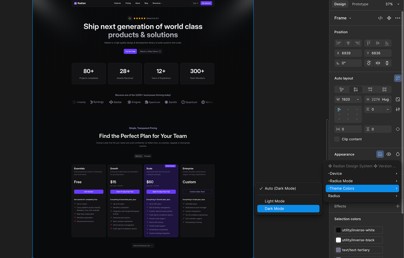
- Dark mode in Development: Radian supports dark mode by default, you can acces those colors in global CSS.
@theme {
	--color-primary: oklch(0.528 0.2539 282.58);
	--color-primary-accent: oklch(0.94 0.0271 295.05);
	--color-primary-focus: oklch(0.9169 0.0383 295.46);
	--color-primary-hover: oklch(0.5768 0.2279 286.25);
	--color-primary-text: oklch(0.4304 0.202 282.82);

	--color-success: oklch(0.6334 0.171 148.65);
	--color-success-accent: oklch(0.9685 0.0336 157.66);
	--color-success-focus: oklch(0.9489 0.0556 156.34);
	--color-success-hover: oklch(0.6901 0.1748 149.64);
	--color-success-text: oklch(0.5388 0.1339 149.74);

	--color-error: oklch(0.64 0.22 26.04);
	--color-error-accent: oklch(0.9465 0.0252 17.61);
	--color-error-focus: oklch(0.9133 0.0414 17.93);
	--color-error-hover: oklch(0.6786 0.2095 24.66);
	--color-error-text: oklch(0.5716 0.2125 27.27);

	--color-warning: oklch(0.8016 0.1705 73.27);
	--color-warning-accent: oklch(0.9622 0.0384 83.83);
	--color-warning-focus: oklch(0.946 0.0574 85.03);
	--color-warning-hover: oklch(0.8342 0.1594 79.51);
	--color-warning-text: oklch(0.5461 0.1088 77.73);

	--color-info: oklch(0.6092 0.2041 255.8);
	--color-info-accent: oklch(0.949 0.0213 245.85);
	--color-info-focus: oklch(0.9135 0.0358 249.52);
	--color-info-hover: oklch(0.6722 0.1615 251.56);
	--color-info-text: oklch(0.4663 0.1065 251.21);

	--color-bg: oklch(1 0 0);
	--color-fill1: oklch(0.9824 0.0013 286.38);
	--color-fill2: oklch(0.9677 0.0027 286.35);
	--color-fill3: oklch(0.9349 0.004 286.32);
	--color-fill4: oklch(0.902 0.0068 286.26);

	--color-fg: oklch(0.2314 0.0078 274.6);
	--color-fg-secondary: oklch(0.4515 0.0243 285.39);
	--color-fg-tertiary: oklch(0.6261 0.0268 285.6);
	--color-fg-disabled: oklch(0.8352 0.011 286.16);
	--color-fg-inverse: oklch(1 0 0);

	--color-border: oklch(0.902 0.0068 286.26);
	--color-alpha: color-mix(
		in srgb,
		oklch(0.1452 0.0021 286.13),
		transparent 88%
	);
	--color-soft: oklch(0.9349 0.004 286.32);
	--color-soft-alpha: color-mix(
		in srgb,
		oklch(0.1452 0.0021 286.13),
		transparent 92%
	);

	--color-elevation-negative: oklch(0.9677 0.0027 286.35);
	--color-elevation-level1: oklch(1 0 0);
	--color-elevation-level2: oklch(1 0 0);

	--color-white-inverse: oklch(1 0 0);
	--color-black-inverse: oklch(0.144 0.0028 247.09);

	--color-fill1-alpha: color-mix(
		in srgb,
		oklch(0.1452 0.0021 286.13),
		transparent 98%
	);
	--color-fill2-alpha: color-mix(
		in srgb,
		oklch(0.1452 0.0021 286.13),
		transparent 96%
	);
	--color-fill3-alpha: color-mix(
		in srgb,
		oklch(0.1452 0.0021 286.13),
		transparent 92%
	);
	--color-fill4-alpha: color-mix(
		in srgb,
		oklch(0.1452 0.0021 286.13),
		transparent 88%
	);
}

.dark {
	--color-primary: oklch(0.528 0.2539 282.58);
	--color-primary-accent: oklch(0.2294 0.0753 289.19);
	--color-primary-focus: oklch(0.2538 0.1064 285.61);
	--color-primary-hover: oklch(0.5768 0.2279 286.25);
	--color-primary-text: oklch(0.7757 0.1162 292.43);

	--color-success: oklch(0.6334 0.171 148.65);
	--color-success-accent: oklch(0.271 0.0537 151.74);
	--color-success-focus: oklch(0.3887 0.0924 150.55);
	--color-success-hover: oklch(0.6901 0.1748 149.64);
	--color-success-text: oklch(0.871 0.1501 153.14);

	--color-error: oklch(0.64 0.22 26.04);
	--color-error-accent: oklch(0.2567 0.0648 22.77);
	--color-error-focus: oklch(0.2973 0.0922 24.71);
	--color-error-hover: oklch(0.6786 0.2095 24.66);
	--color-error-text: oklch(0.7884 0.1226 20.19);

	--color-warning: oklch(0.8016 0.1705 73.27);
	--color-warning-accent: oklch(0.2663 0.0372 84.34);
	--color-warning-focus: oklch(0.3744 0.0636 81.14);
	--color-warning-hover: oklch(0.8342 0.1594 79.51);
	--color-warning-text: oklch(0.8776 0.1255 82.88);

	--color-info: oklch(0.6092 0.2041 255.8);
	--color-info-accent: oklch(0.2739 0.0462 248.76);
	--color-info-focus: oklch(0.3147 0.0668 250.78);
	--color-info-hover: oklch(0.6722 0.1615 251.56);
	--color-info-text: oklch(0.829 0.0811 248.83);

	--color-bg: oklch(0.144 0.0028 247.09);
	--color-fill1: oklch(0.1652 0.0062 285.7);
	--color-fill2: oklch(0.1881 0.006 285.81);
	--color-fill3: oklch(0.2314 0.0078 274.6);
	--color-fill4: oklch(0.2738 0.0093 276.77);

	--color-fg: oklch(1 0 0);
	--color-fg-secondary: oklch(0.6619 0.0235 285.74);
	--color-fg-tertiary: oklch(0.5553 0.0292 285.41);
	--color-fg-disabled: oklch(0.4515 0.0243 285.39);
	--color-fg-inverse: oklch(0.2314 0.0078 274.6);

	--color-border: oklch(0.2738 0.0093 276.77);
	--color-alpha: color-mix(in srgb, oklch(1 0 0), transparent 88%);
	--color-soft: oklch(0.2314 0.0078 274.6);
	--color-soft-alpha: color-mix(in srgb, oklch(1 0 0), transparent 92%);

	--color-elevation-negative: oklch(0 0 0);
	--color-elevation-level1: oklch(0.1881 0.006 285.81);
	--color-elevation-level2: oklch(0.2314 0.0078 274.6);

	--color-white-inverse: oklch(0.144 0.0028 247.09);
	--color-black-inverse: oklch(1 0 0);

	--color-fill1-alpha: color-mix(in srgb, oklch(1 0 0), transparent 98%);
	--color-fill2-alpha: color-mix(in srgb, oklch(1 0 0), transparent 96%);
	--color-fill3-alpha: color-mix(in srgb, oklch(1 0 0), transparent 92%);
	--color-fill4-alpha: color-mix(in srgb, oklch(1 0 0), transparent 88%);
}How to Make Custom Themes
- New Theme Mode: Add a new theme mode in the theme variable file.
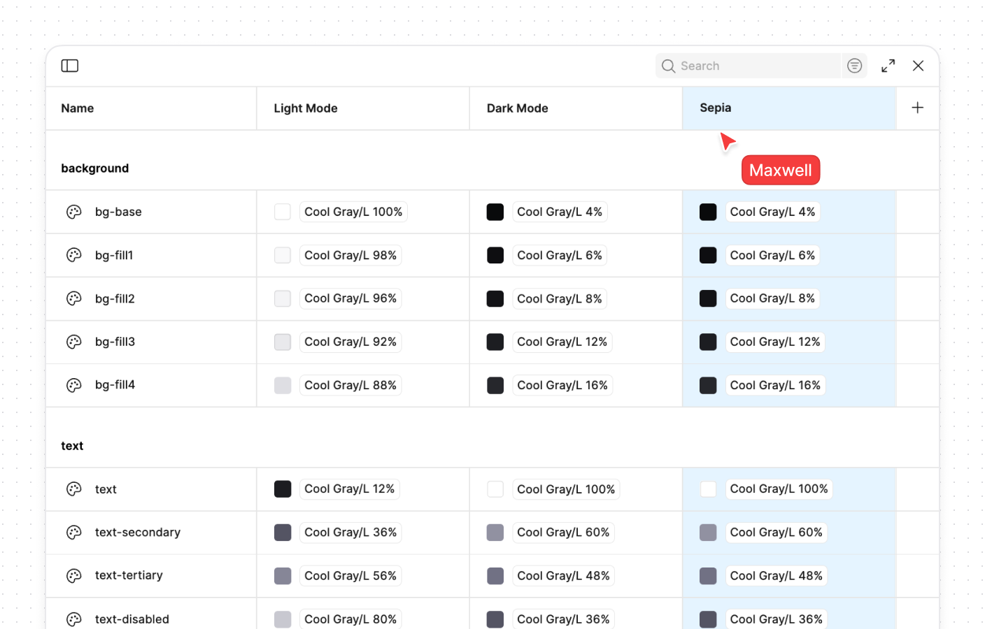
- Tweak colors: Change the theme colors according to your liking
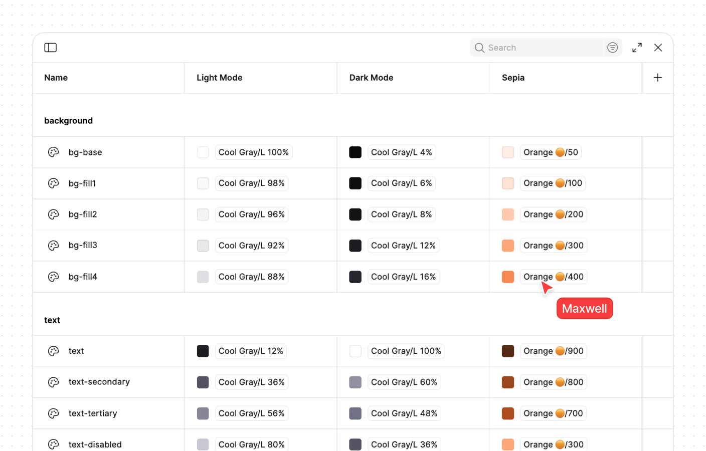
- Change Mode in Design: Change the appearance to the new ‘Sepial’ Theme
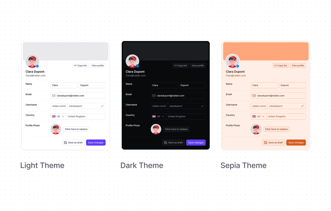
Custom Theme Samples
Nancy Mureum
#2126
+977 9861038740
| Su | Mo | Tu | We | Th | Fr | Sa |
|---|---|---|---|---|---|---|
Saru Shrestha
saru@radian.com
PROGENERAL
View Profile
Keyboard shortcuts
Change logs
Slack Community
Support
API
Settings
Log out
Report an issue
What area are you having problems with?
Invite team members
Send instructions to join your workspace
Cookie Settings
Manage your cookie settings here.
Strictly Necessary
These cookies are necessary for website functionality.
Functional Cookies
These cookies enable personalized features on the site.
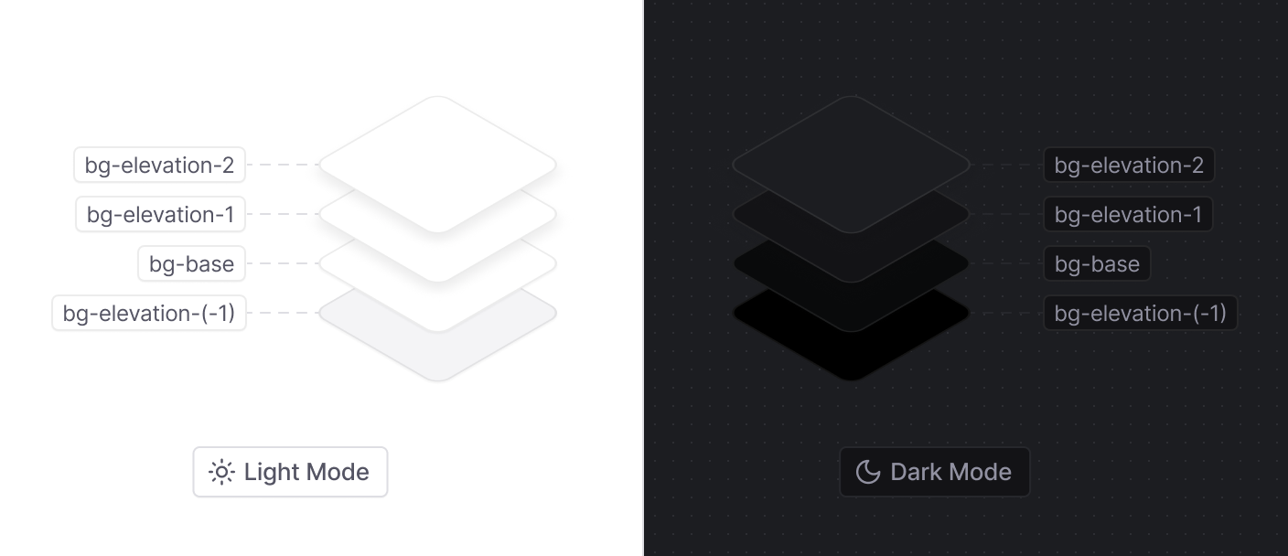
Elevation Colors
Elevation helps create a sense of depth in interfaces by showing how elements are layered above one another. In light mode, this is usually done via shadows, but in dark mode, shadows alone don't work as effectively, and just color inversion often makes designs look flat or oddly inverted.
Radian solves this by using a dedicated set of elevation colors designed for dark mode to make sure visual depth is maintained.